Showing posts with label color: pink. Show all posts

8/06/2011

Streetwear Merry: Swatch Picture and Review

In my opinion, this is one of the less exciting SW holiday polishes:


Pinkish-red shimmer with a watery formula? Do not want. I bought it to help round out my collection of Streetwear holiday polishes (so far I have Merry, Mrs. Claus, Grinch, and Elf) but as I'm moving away from being a collector and more towards being a minimalist in all aspects of my life, I think I'm getting ready to give this guy a new home.

11/27/2010

swatch: opi the show must go on!

the day after thanksgiving i wore opi the show must go on!, which quite frankly, i hated... screamingly bright pink-orange foil is so not my scene:


this polish applied smoothly (two coats are shown above), and i know many people love this shade, but again, the color really just isn't for me. i'm actually somewhat relieved, as i bought mac bad fairy right when it was released but never wore it because i was disappointed by the murky/muddy quality it had. at the same time, however, i was hesitant to jettison something so highly coveted without even a cursory swatch. but now i can safely assume that i won't like bad fairy either and can feel comfortable offloading it!

boy says: "that looks finely textured, like pink aluminum foil."

5/12/2010

swatch: nails inc. brook street

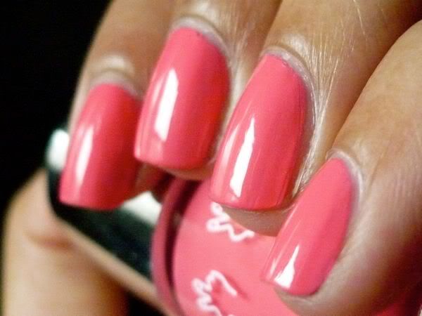
i've been trying to photograph my notd, opi ogre-the-top blue, for the past two days now with no luck - it's been so overcast here that i don't have enough light to get a color-accurate pic. so here's an notd from last week instead, nails inc. brook street:


this is a very pretty pink-toned coral... i love it! it reminds me a bit of rbl coral, but the two polishes certainly aren't identical. i paired brook street with a fluorescent yellow dress, brown chunky platform sandals, and a bright red pedi. :) three coats.

5/11/2010

swatch: nails inc. hollywood

fabulous candy pink!


unfortunately, the application of this shade wasn't quite so fabulous - it was somewhat streaky and patchy, requiring me to apply it thickly to get it even in three coats. these application issues surprised me, as nails inc. polishes tend to have a consistently good formula. i love the color, though, so i can definitely see myself reaching for hollywood again... just not when i'm in a rush or need an easy mani!

5/05/2010

swatch: opi paint my moji-toes red

i got this on sale for $1.99 at ricky's... hurray!


two coats. this polish was an absolute dream to apply - it glided on soooo smoothly. the color of this photo unfortunately varies a bit from browser to browser, so if it looks salmon or quite muted to you please know that that isn't an accurate representation. irl, paint my moji-toes red is a pink-red that's quite vibrant.

4/14/2010

swatch: opi that's hot! pink

earlier this week, i decided i wanted a bright pink mani to match the warm weather we were having and the flowered dress i was wearing:


opi that's hot! pink is a very bright blue-toned pink - normally i stay away from such colors because of my warm undertones, but i think the brightness of this shade makes it work even on my yellow-toned skin. this polish is more sheer than most of my other opi cremes (which generally go on well for me in two coats), but it was pretty much opaque in three coats and its application was otherwise good. the accuracy of this photograph is off in some browsers, so please note that that's hot! pink is an *extremely* vivid/saturated pink irl.

3/09/2010

swatch: rescue beauty lounge coral

this photo varies wildly depending on the browser in which i view it, so just for reference rbl coral is a very vivid and juicy pink with slight melon undertones.


i absolutely love this color; it's so spring-y and thus perfect for the warm weather we've been having lately. it required just two coats for opacity and applied very smoothly... i adore rbls!

bf says: "you can see the reflection of the window in your nails. a csi person would be able to figure out where you live."

1/14/2010

swatch: rescue beauty lounge lulu

this polish didn't have quite the opacity and smoothness of most other rbl cremes i own, so this mani required three coats:


i wore lulu with a super severe black dress - heavy fabric, high neck, and sharp, padded shoulders. i loved the contrast.

12/20/2009

swatch: illamasqua grab

hi guys! sorry to have been so absent from here - my laptop kicked the bucket pretty much as soon as i landed in california, and until it's fixed i don't have access to my saved pictures or any photo editing software. but while i've got a second, here's a photo of the notd i wore for *gasp* four days last week, illamasqua grab:


unfortunately, this isn't a color-accurate photo - this polish is much darker and richer irl. but while grab is tough to capture, it's lovely to apply... creamy and opaque in two coats.

bf says: "that looks like a lisa frank trapper keeper."

11/17/2009

swatch: illamasqua lament

another old one...


while i like this color, i was at the same time disappointed by it. from the photos that influenced my purchase, i was expecting lament to be lighter and more muted, and instead it turned out to be a super-bright pink. i like super-bright pinks... but i also have about 2348209384 of them already.

also, the application of this polish wasn't as smooth/great as that of the other illamasquas i own. the polish itself was easy to control (that is, it went where i put it), but the result was chalky and uneven. the above picture is three coats plus touch-ups.

11/16/2009

swatch: zoya nova

another beautiful ultra glitter from zoya!


formula-wise, this is very similar to zoya astra (pics): sheer at first, but easily built up to opacity in three coats. the texture of both of these ultra glitters is thin and smooth, for which i'm grateful... thick jelly glitters that glob off the nail are such a huge pain to work with. and for those of you worried about grittiness, nova was smooth enough with one coat of t/c, although for total glassy perfection i'd go with two.

while i like nova a lot, i do think it's better suited to paler, cooler skin tones than my own (check out how gorgeous it looks on tobywoo here). for tan, warm girls like myself, astra is the better pick.

bf says: "that's too glittery for me, i think."

11/02/2009

swatch: zoya astra

it's my birthday today, and i figured the occasion deserved a little celebratory glitter!


i love vivid pinks and i love jellies with glitter, so it's no surprise that i love astra, a vibrant pink jelly with both dark pink and light pink glitter. application was really great, especially for a glitter - the above pic is three coats, with a couple of additional touchups.

with topcoat, astra is very smooth; however, this smoothness doesn't always come across in photos because it's a jelly (which makes it easier to see the individual glitter pieces, which in turn gives the impression of grittiness). but check out the glassy shine on this pic... hopefully this helps to demonstrate astra's glossy evenness:


10/23/2009

swatch: nails inc little venice

so i decided to suck it up and take a quick picture. any application issues are 100% my fault - the polish itself was fine (albeit sheer). this photo is of three coats:


this is a great example of a polish that really changes with skin tone. on me, little venice doesn't have even a hint of the peach/pale coral tones it has on others - it's straight up milky baby pink. it looks like a jelly on the first coat, simply because it's so sheer, but once the coats are built up it loses that translucence.

i have to say, this color isn't "me" at all - i only got it because i couldn't find a source to buy the cruise collection polishes separately. i caught a glimpse of my nails while blasting my old stp favorites on my ipod at the post office and felt super awkward... it's definitely coming off the first chance i get!

10/18/2009

swatch: nails inc. festival pier

i was expecting this to be a creamy coral-pink based on pics, but it turned out to be pretty much a neon. tbh, i'm pretty bummed about this one; it was quite chalky and thick, and i expect better from a nails inc. creme. and of course, given its neon hue it was a major pain to photograph - i made a half-hearted attempt to photoshop this picture into color accuracy but gave up pretty quickly. in this picture we have 3 coats, plus touchups:


now off to do a quick mani - must think of something that will entertain me through a full day of teaching plus be party-appropriate for evening!
Related Posts Plugin for WordPress, Blogger...