Showing posts with label comps. Show all posts

8/19/2011

Rescue Beauty Lounge No More War vs. MAC Dry Martini: Comparison Swatch Picture and Review

On Monday, I posted a picture of olive-green-brown RBL No More War. Another shade in the same general color family (albeit a much darker and browner version) is MAC Dry Martini, which was released as part of the Nail Trend FW09 Jin Soon collection (along with Cool Reserve, Dance All Night, For Fun, Rich Dark Delicious, and Beyond Jealous… none of which I bought). The marked difference between the two polishes can hopefully be seen in the following comparison shot:


In the picture above, RBL No More War is on my index and ring fingers, while MAC Dry Martini is on my middle finger and pinky.

I discuss the qualities of No More War in Wednesday's post. As for Dry Martini, it was my first MAC polish, and going in I was a bit worried as I'd heard bad things about the application of MAC polishes. However, Dry Martini was creamy, even, and richly pigmented (the swatch you see is two coats), and on top of that I loved the brush! It made for easy, neat application

5/10/2010

comparison swatch: opi mrs. o'leary's bbq and opi vampire state building

opi mrs. o'leary's bbq is widely reputed to be a dupe for the htf opi vampire state building. in my opinion, however (and unfortunately for those of you seeking a more easily accessible alternative to vampire state building), the two polishes aren't actually identical.

in the following photos, i have vampire state building on my index (leftmost) and ring fingers and mrs. o'leary's bbq on my middle and pinky (rightmost) fingers. i did three coats of each polish, although mrs. o'leary's bbq (owner of one of my favorite polish abbreviations ever, "molbbq") only needs two if you let it dry a bit longer than i did.


vampire state building and mrs. o'leary's bbq have completely different undertones, and the difference between the polishes is visible in regular natural light. vampire state building's undertones are brown, while those of mrs. o'leary's bbq are purple. the two shades are closer on the nail than in the bottle, though.

vampire state building and opi a man in every port-ugal look closer in the bottle than vampire state building and mrs. o'leary's bbq do (leaving aside a man in every port-ugal's subtle shimmer); i'll comp them at some point.

here's a lighter (albeit slightly washed out) pic to better show the different tones of the two polishes:


btw, for those of you who are interested, i posted a full mani with molbbq here.

4/19/2010

comparison swatch: rescue beauty lounge bangin' and opi red my fortune cookie

if you missed the recent rbl surf collection pre-sale or didn't want to shell out the big bucks for those polishes, you're in luck... because opi red my fortune cookie is pretty much a perfect dupe for rbl bangin'.


in this photo, i have bangin' on my index (leftmost) and ring fingers and red my fortune cookie on my middle and pinky (rightmost) fingers. please note that some browsers distort colors and that rmfc and bangin' are both bright warm reds... neither is orange at all irl.

in terms of color: in indoor/dim lighting, these two polishes are perfect matches. in bright lighting, bangin' appears to be just a hair more vividly red than red my fortune cookie, but i had to really look to make out this tiny difference.

in terms of formula/application: i would describe the formula of red my fortune cookie as great, and the formula of bangin' as absolutely perfect. both of these polishes went on very smoothly and had great pigmentation (requiring two coats for total opacity), but the formula of bangin' is just… sooooo unbelievably buttery smooth.

11/28/2009

comparison swatches: avon golden twilight, china glaze wagon trail, and opi ds mystery

a friend on the nb was planning an avon order and was curious how golden twilight compared to some similar polishes from other brands, so i took the opportunity to do these swatches:


from left to right:

china glaze wagon trail (on my index finger) is a black base color packed with fine gold shimmer, giving the polish an overall olive appearance. it's a well-done polish, but the shimmer is too fine to really appeal to my taste these days.

avon golden twilight (on my middle finger) actually has a very deep blue-purple base (captured well by steph's closet), but it looks pretty much black on my nails. the gold shimmer in golden twilight is chunkier than the shimmer in wagon trail yet doesn't shine through the base color well, giving this polish a muddy appearance. i wish i'd passed on this one!

opi ds mystery (on my ring finger) is my favorite of the bunch. while it's not the deep purple holo i had imagined when i first heard that a purple ds polish was in the works, i still love it. this polish has a base color that's much more strongly purple than golden twilight's (although to be fair, it's still quite close to black) as well as very chunky gold shimmer that stands out nicely. i'll definitely be doing a full notd with this one soon.

11/24/2009

comparison swatches: bb couture, illamasqua, rescue beauty lounge, and zoya greens

i haven't yet decided on today's notd (currently leaning towards nails inc. curzon street, but we'll see), so in the meantime here are some green comparison swatches i did this past weekend.
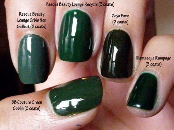

from thumb to pinky: bb couture green goblin, rescue beauty lounge orbis non sufficit, rescue beauty lounge recycle, zoya envy, and illamasqua rampage. orbis non sufficit is the dustiest of the bunch and has the best formula, envy is (clearly) the darkest, and rampage is the only one of these polishes with a jelly finish.

i wasn't thinking and didn't include orly enchanted forest in this comp, so i'll try to take pics with it included in the near future. i also have a dark green from l.a. girl's flare line that might be interesting to compare as well.

as you can see from the above pic, green goblin and recycle are quite similar, so i did a second comp featuring just those two polishes:
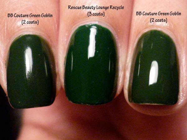

bb couture green goblin on index and ring finger, rescue beauty lounge recycle on middle finger.

recycle is more of a "clear"/true green, whereas green goblin is more yellow/brown (which i personally prefer). also, green goblin's formula is superior to recycle's - while green goblin was perfect in two coats, recycle was more watery and needed three coats for complete evenness.

scrangie has a comp of recycle and green goblin here that makes the two polishes look much more different from each other, but i can honestly say that they didn't look nearly that different on me, even under a bright desk lamp. the pic i posted above is literally the *most* different they ever look on me, and in most/dimmer lighting, the two polishes are practically indistinguishable.

10/30/2009

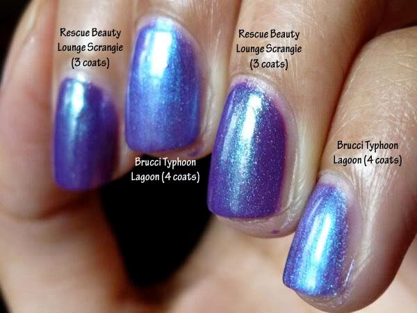
comparison swatch: rescue beauty lounge scrangie and brucci typhoon lagoon

just did this for one of the nb girls, so figured i'd post it here as well.

scrangie is on my index and ring fingers; typhoon lagoon is on my middle finger and pinky. irl, they generally appear more different than they do in this pic (i think because the shimmer takes over in photos and makes it harder to see the differences in base color), but at some angles/in some lighting they do look quite similar.


main differences:

- opacity: this swatch is 3 coats of scrangie and 4 of typhoon lagoon. i bet scrangie would've only needed 2 though, had i been more careful.

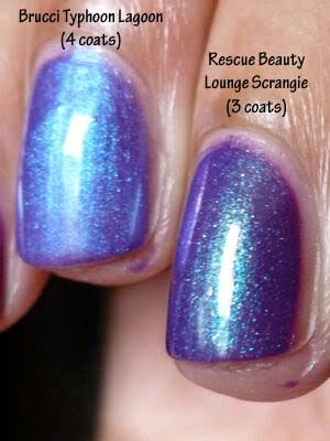
- shimmer particles: the shimmer in typhoon lagoon is more "frosty" (which imo makes it more cheap-looking), whereas the shimmer in scrangie appears in larger, distinct particles. this difference is seen better in the pic below than in the one above.

- color of shimmer/duochrome effect: typhoon lagoon's is plain light blue, whereas scrangie's is green/greenish (which makes it, imo, more interesting).

- base purple color: scrangie has a slightly darker purple base color than typhoon lagoon, and then the fact that scrangie's shimmer is in particles rather than an all-permeating frost makes it look darker still (because the overall appearance of the polish isn't lightened by the shimmer in the way that typhoon lagoon's is). here's a pic that shows this well:


overall, i greatly prefer scrangie, not only for its ease of application but also for its darker purple color and its distinct shimmer particles rather than frosty appearance.
Related Posts Plugin for WordPress, Blogger...