12/18/2010

streetwear elf: swatch picture and review

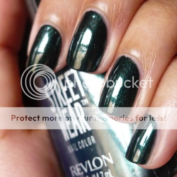
here's a swatch of one of my very favorite streetwears... elf!


and a close-up to highlight the shimmer:


i love a murky dark green... you all know that normally i don't enjoy shimmer, but for some reason i like elf. a limited-edition holiday polish long since discontinued, elf is vhtf, so i feel quite lucky to have scored this beauty!

looking forward to the day ahead - first, a playdate with an old friend (who i haven't seen in months after years of seeing him nearly every day), followed by a holiday party/made-it-through-the-semester celebration with the other members of my program. and of course, keeping my fingers crossed about the DREAM act!

12/11/2010

streetwear grinch: swatch picture and review

i was lucky enough to find a few christmas streetwears earlier this year, so i thought i'd post them in these weeks leading up to the holidays!


sw grinch is a beautiful fine green glitter that i'm thrilled to own! on my middle and pinky fingers two coats of grinch are layered over three coats of streetwear mrs. claus, and on my index and ring fingers i'm wearing four coats (plus a couple of touch-ups) of grinch on its own. so festive!

a note: grinch is vvvhtf, but according to karen of pretty random (who's a thousand times more knowledgeable about older polishes than i could ever hope to be), icing lucky charm is a perfect dupe!

12/06/2010

swatch: lippmann across the universe

i'm scheduling this post for monday morning, but right now it's sunday night and i'm frantically finishing a giant research & practice project, so i'll let the polish speak for itself:


and a close-up:


three coats of this gorgeous dark blue jelly with blue regular glitter, blue hexagonal glitter, and green hexagonal glitter.

boy says: "embedded hexagonal glitters. marvelous."

12/02/2010

swatch: color club high society

wow, talk about a polish that looks really different against different skin tones... compare how it looks on me (tan and warm-toned) to how it looks on scrangie (pale and cool-toned)! this is a shade that looks much better on light skin, imo.


please excuse the boosh remnants still stuck in my cuticles! i wore this np, from color club's rebel debutante collection, a few days ago to start the week off with a work-appropriate shade. application was smooth and opaque in two coats.

boy says: "i had a packard bell legend computer in 1994. it was this exact color."

11/30/2010

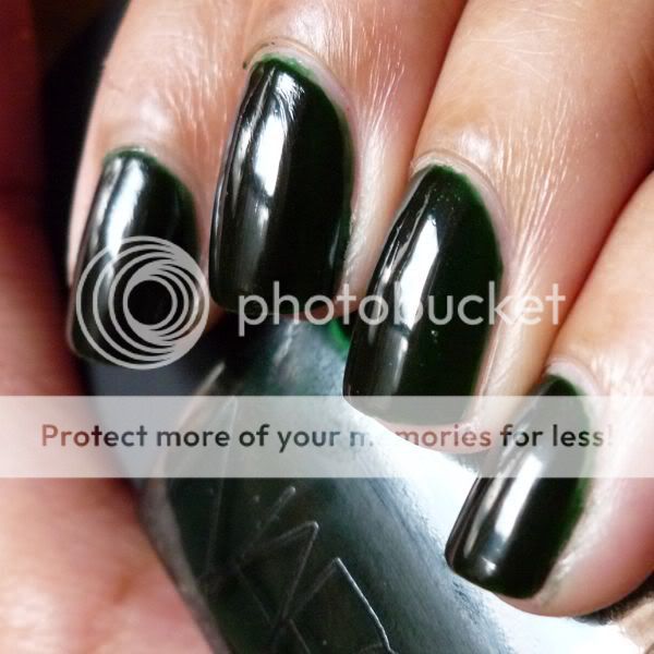
swatch: nars zulu

vvvvvhtf and highly coveted for years, nars zulu was rereleased a couple of months ago - and i was thrilled to get my hands on this piece of nail polish history!


i'd heard that zulu was a streaky pita to apply, but luckily the (reformulated) new version wasn't bad at all. i applied three coats for the mani above and found that overall, the application of the polish was fine and its appearance was quite even. i'll admit, though, that i did preemptively wait a bit longer than i usually do between coats, just to ward off any potential issues. on the one finger where i tried to touch up a nail that had started to dry but wasn't fully set, the polish did pull away a bit, leaving a bald spot (that luckily was easily fixed).

one other thing potential buyers/swappers should be aware of - as far as i can tell, the square caps on nars polish bottles do not pull off, unlike the caps on illamasqua or chanel bottles. this doesn't get in the way of application too much, but just a heads-up.

while i like zulu a lot, i'm still not a jelly convert... at the end of the day, while i do appreciate zulu's glassy finish, i'd still prefer a dark green creme (like sephora by opi dark room or zoya envy).

boy says: "look at the sloppy application on your pinky!" :(

11/29/2010

swatch: zoya charla

since i hated that last mani so much, how about i now post a mani i love:


zoya charla is probably my favorite of this past summer's sparkle collection (although ivanka is a close second). so sparkly and vivid (and a bit more green) irl! i actually haven't worn this since the summer, as in my opinion this color and finish don't go well with the more professional attire and fairly subdued hues i sport during the school year (i know there are others who disagree and wear any nail polish with any outfit, but this is what works for me and my style). but i loved this color when i wore it a few months ago and can't wait for the warmer months (with their accompanying bright colors and bold prints) to roll around again so that i can break this shade out once more! this picture is of three coats.

boy says: "zoya seems to make good nail polish." direct quote, i kid you not.

11/27/2010

swatch: opi the show must go on!

the day after thanksgiving i wore opi the show must go on!, which quite frankly, i hated... screamingly bright pink-orange foil is so not my scene:


this polish applied smoothly (two coats are shown above), and i know many people love this shade, but again, the color really just isn't for me. i'm actually somewhat relieved, as i bought mac bad fairy right when it was released but never wore it because i was disappointed by the murky/muddy quality it had. at the same time, however, i was hesitant to jettison something so highly coveted without even a cursory swatch. but now i can safely assume that i won't like bad fairy either and can feel comfortable offloading it!

boy says: "that looks finely textured, like pink aluminum foil."

11/26/2010

thanksgiving notd/swatch: nubar raspberry truffle + finger paints holly good time

hi everyone! sorry for the extended absence but my new job and grad school are keeping me very busy (not to mention far from my camera during the daylight hours!). i have a couple of days off for thanksgiving, though, so i thought i'd post pics of the mani i wore for the holiday:


this is two coats of nubar raspberry truffle topped with one coat of fp holly good time (courtesy of my dear friend michelle, since we don't have sally's here!). i was really impressed by the smooth application of the nubar as well as how dense the glitter was in the fp. in fact, my original intention was to do a holly good time gradient over raspberry truffle, but i had to abandon that idea once i realized the glitter in holly good time was offering far too good of coverage for that to work. it's hard to tell in this picture, but holly good time is also super sparkly, and i look forward to wearing it again (perhaps layered over a different polish, perhaps solo) closer to christmas.

boy says: "you can't focus your eyes on it. it's just too much."

hope all of you who celebrate had a nice thanksgiving!

5/29/2010

streetwear toad: swatch picture and review

this is my favorite version of sw toad... beautiful olive green shimmer:


this polish is fairly thin and watery and tends toward bald spots, so i did four coats to get this evenly opaque. worth it, though! thanks to my sweet friend amy for hooking me up with this pretty!

5/21/2010

american apparel summer 2010 swatches part 1: butter, malibu green

hi everyone! sorry for my absence the past couple of days... we've hardly had any sun around here, which makes photographing polishes no fun! this morning, however, we had some nice weather, so i thought it would be a great time to swatch a couple of the latest offerings from american apparel.

as i've posted before, being a die-hard creme lover i'm a big fan of smerican apparel's range of polishes, so i was thrilled to hear that this summer, they were expanding their line to include five new colors: butter, california trooper, l'esprit, malibu green, and summer peach.

i had mixed feelings about butter - i loved the color, a gorgeous warm soft yellow, but i did have issues with the application:


yellows are notoriously difficult to apply, and butter wasn't particularly awful in that respect; it was both thick and runny, and somewhat streaky as well, but most people could probably get it to work in three thick coats (since i didn't figure this out through midway through my application, i used four regular coats for the swatch above). however, the american apparel brush is designed in such a way that the stem retains a lot of polish even if you wipe off your brush well, causing drips and mess if you aren't careful. thus, in order to have a controlled, neat manicure, you have to wipe off the brush and stem so thoroughly that you simply don't have enough polish left to do properly thick coats. if you're able to figure out how to apply butter in a way that works for you, though, the color is very pretty.

malibu green on the other hand, had an awesome formula, and i really liked the color as well:


(please note that the polish is brighter and more saturated irl.) this had the thin, super-pigmented formula that i love and think of as being typical of american apparel's polish! with all my love of crazy polish i've never really ventured into bright blues and greens, so i was surprised by how much i loved this shade... i actually wound up wearing it for three days! the formula of this polish was excellent - smooth and very easy to work with - and it was opaque in two thin coats. malibu green makes a great pop of color against the blacks and neutrals i insist on wearing even throughout the summer, and i'm looking forward to breaking it out again.

i should have the rest of the american apparel summer colors (california trooper, l'esprit, and summer peach) swatched and posted for you on monday... i'll update this post with a link once that's done. happy weekend!

disclosure: the products in this post were sent to me by american apparel for consideration
5/15/2010

streetwear midnight and streetwear fx flash (blue version): swatch pictures and review

for today installment of streetwear saturdays, i started with three coats of sw midnight, a glowy dark blue shimmer:


i'm not really a fan of blue shimmers (well, any shimmers, but blue shimmers in particular), so i decided to top this mani with a little glitter to make it more my style. here's sw midnight with one coat of sw fx flash (the blue version) on top:


full disclosure: i got this idea from a gorgeous mani done by another np lover... afraid i can't take credit for it! while i like the blue version of fx flash well enough, it's the green/chameleon version that i really love. for pics of that polish, please check out my posts here and here.

5/14/2010

swatch: china glaze electric lilac

i'm still wearing opi girls just want to play from yesterday, so here's a polish i swatched recently - chg electric lilac:


electric lilac is quite sheer and i didn't feel like building it up to opacity, so for this picture i put two coats over nails inc. basil street (a beige-nude creme). the polish was pretty goopy, so i was glad i made the decision to not struggle through four coats of it.

happy friday! hope you all have a nice weekend. :)

5/13/2010

swatch: opi girls just want to play

i love this! from the 2008 holiday in toyland collection:


girls just want to play is brighter and more pink-toned irl and has a totally fabulous formula (two coats seen above). i can see myself wearing this again and again!

5/12/2010

swatch: nails inc. brook street

i've been trying to photograph my notd, opi ogre-the-top blue, for the past two days now with no luck - it's been so overcast here that i don't have enough light to get a color-accurate pic. so here's an notd from last week instead, nails inc. brook street:


this is a very pretty pink-toned coral... i love it! it reminds me a bit of rbl coral, but the two polishes certainly aren't identical. i paired brook street with a fluorescent yellow dress, brown chunky platform sandals, and a bright red pedi. :) three coats.

5/11/2010

swatch: nails inc. hollywood

fabulous candy pink!


unfortunately, the application of this shade wasn't quite so fabulous - it was somewhat streaky and patchy, requiring me to apply it thickly to get it even in three coats. these application issues surprised me, as nails inc. polishes tend to have a consistently good formula. i love the color, though, so i can definitely see myself reaching for hollywood again... just not when i'm in a rush or need an easy mani!

5/10/2010

comparison swatch: opi mrs. o'leary's bbq and opi vampire state building

opi mrs. o'leary's bbq is widely reputed to be a dupe for the htf opi vampire state building. in my opinion, however (and unfortunately for those of you seeking a more easily accessible alternative to vampire state building), the two polishes aren't actually identical.

in the following photos, i have vampire state building on my index (leftmost) and ring fingers and mrs. o'leary's bbq on my middle and pinky (rightmost) fingers. i did three coats of each polish, although mrs. o'leary's bbq (owner of one of my favorite polish abbreviations ever, "molbbq") only needs two if you let it dry a bit longer than i did.


vampire state building and mrs. o'leary's bbq have completely different undertones, and the difference between the polishes is visible in regular natural light. vampire state building's undertones are brown, while those of mrs. o'leary's bbq are purple. the two shades are closer on the nail than in the bottle, though.

vampire state building and opi a man in every port-ugal look closer in the bottle than vampire state building and mrs. o'leary's bbq do (leaving aside a man in every port-ugal's subtle shimmer); i'll comp them at some point.

here's a lighter (albeit slightly washed out) pic to better show the different tones of the two polishes:


btw, for those of you who are interested, i posted a full mani with molbbq here.

swatch: opi miami beet

when changing my polish yesterday afternoon, i had my roommate pick my mani. she suggested a "bright, red-toned purple," and the closest thing i had in my untrieds was opi miami beet!

here it is in the sun:


and since this polish darkens considerably in dimmer lighting, here it is in regular natural light (it's darker still indoors):


when i was placing the etailer order in which i got miami beet, i idly wondered to myself how i'd managed to do without this shade for so long, considering the number of people who rave about it. once the polish had arrived and i had unpacked it, though, i remembered why i'd avoided picking it up in the past - it's reputed to be a dupe for zoya moxie, which i already own. the two polishes do look slightly different in the bottles, so i'll need to do a comp at some point to figure out their precise similarities and differences.

by the way, with regard to formula miami beet is like the vast majority of the opi cremes i own - pigmented, smooth, and opaque and two coats.

5/09/2010

swatch: opi dazzled by gold

dazzled by gold was an ulta exclusive during last year's holiday season. i was luckily able to score this polish through a swap, as there's no ulta here. this is my very first real gold polish (i.e. one that isn't a glitter topcoat)!


i'm a big fan of chunky, over-the-top rings and bracelets, but yesterday i thought i'd wear the bling on my nails for a change! i wasn't a huge fan of this polish at first, but it grew on me, and by the end of the evening i couldn't stop admiring my nails. btw, i think this would look totally striking on someone with a darker skin tone!

dazzled by gold does go on quite sheer at first, but as you build up the layers the big shimmer particles come together to create an awesome foily finish. this polish was pretty much opaque in three coats, but i did four just to make sure any bald spots were fully covered.

p.s. happy mother's day to all you moms out there, especially mine! ♥

5/08/2010

streetwear moody: swatch picture and review

i was lucky enough to find this vhtf polish in a dusty just last week!


this is often referred to as the "creme" version of moody (sometimes spelled "mmoody"), but this polish isn't actually a pure creme. instead, it features a subtle but still visible shimmer. this shimmer may be a bit difficult to detect in this picture, however, because this polish reacted badly to the seche vite topcoat i applied over it, resulting in lots of small bubbles and other texture issues. apologies! btw, this swatch is of three coats of moody.

the other (and much more common) version of moody that i own isn't opaque, isn't creme-like, and isn't turquoise/teal; instead, it's a very sheer blue shimmer. at first i thought i'd never wear it, but after seeing emalc's pic of this sheer version of moody layered over black, i'm starting to think i should at least give that layered look a chance.

5/07/2010

swatch: nails inc. upper street

a very pretty jelly-ish aqua shade:


when i first started to apply upper street, i was concerned that it would need several coats for opacity (and i was feeling lazy that day); luckily, it became even with the addition of a second coat. a comp with chg flyin' high and chg shower together is in the works!

5/06/2010

swatch: nails inc. belgrave place

nails inc. belgrave place (not to be confused with nails inc. belgrave square, a shimmery pink) is amazing! it's a beautiful, vivid, super-glossy blurple jelly:


this polish totally, totally rules. depending on the lighting conditions, it ranges from a purple with strong blue undertones to a deep, rich blue to a shiny, gorgeous vampy. (my pic might be a bit too blue in some browsers; sorry about that!) a particularly great thing about belgrave place is that while it's a jelly, it doesn't come along with the annoying side effect of most jellies: vnl (visible nail line). instead, it was opaque in three coats.

5/05/2010

swatch: opi paint my moji-toes red

i got this on sale for $1.99 at ricky's... hurray!


two coats. this polish was an absolute dream to apply - it glided on soooo smoothly. the color of this photo unfortunately varies a bit from browser to browser, so if it looks salmon or quite muted to you please know that that isn't an accurate representation. irl, paint my moji-toes red is a pink-red that's quite vibrant.

5/04/2010

swatch: nails inc. draycott pl.

we had such summery weather here in new york this past weekend that i decided it was time to break out this fabulously juicy orange!


draycott pl. is my new favorite orange - it's so vivid and so pigmented. i wore it with this dress to wander around the city on a hot saturday afternoon, eating raspberry sorbet and idling in union square park... totally freaking awesome. two coats.

4/28/2010

swatch: chanel illusion d'or over american apparel hassid

when the chanel noir et or paris-shanghai polishes (black velvet, gold lamé, and illusion d'or) first went up on the chanel website, i was tempted by them but ultimately decided not to purchase any. once they appeared to have sold out, however, i felt a momentary panic... maybe i did want them after all, and now they were gone forever, never to be seen anywhere again except for on ebay for $300+! (lest my male friends who read this blog think i'm being hyperbolic, that's what really happened with the last chanel limited edition nail polish, jade - it now sells for several hundred dollars.) so when i saw the polishes back up on the chanel site, i clicked "purchase" without letting myself think twice.

i ultimately wound up purchasing both black velvet (mostly for the packaging, not gonna lie) and illusion d'or. since black velvet can't be worn with topcoat and i'm a slave to my quick-dry, i'll be waiting to wear that one 'til i have a nice chunk of free time; illusion d'or, however, i put on the day after it arrived.

first, a bottle pic:


and a close-up of the polish in its bottle (those little purple iridescent pieces are the coolest thing about this polish, imo):


and now for some mani pics! i put one coat of illusion d'or over american apparel hassid, a fabulously pigmented black that works great for layering! here's the result in overcast light:


in regular natural light:


and finally, in bright sunlight so that you can see how dense yet fine the glitter is:


also, here's a close-up so that you can see the individual glitter particles better. please excuse the leftover red polish on my nail!


all in all, i think illusion d'or is quite pretty. it's still growing on me - i normally prefer cremes or in-your-face bling - but i do like it, especially when the purple bits catch the light.

4/27/2010

swatch: opi cajun shrimp

this is my all-time favorite nail polish! my bottle's like... one-third gone, which is a huge deal considering the absurd number of polishes i own.


(some browsers wash this pic out, apologies!)

i don't even know how to describe the color... i hesitate to call it a coral because it's so red, but i think that's technically what it is. i just think of it as an amazing, super-vivid blend of red, orange, and pink, which i especially love in the summer. the application is great too - two easy, pigmented coats, and you're good to go.

4/24/2010

rescue beauty lounge grunge and streetwear black widow: swatch pictures and review

recently, i was given a tip as to where i could find a treasure trove of old revlon streetwears, and this was one of the long-discontinued and htf polishes i scored! rbl grunge looked totally wack on me on its own (i'll do a full post on it soon, but in a nutshell: brown girls beware!), but i thought its fairly nude/neutral color would make a good base for black widow:


my inspiration was a manicure done by my friend eve, in which she layered black widow over a nude polish to create the effect of a nude slip dress topped with a black mesh, lace, and sequined overlay. her mani was far superior to mine though - i did 3 or 4 coats of the sw, but maybe i should have done even more!

here's a close-up shot of black widow so you can see all the various kinds of glitter it contains: black regular glitter, silver regular glitter, and black bar glitter:

4/20/2010

swatch: opi mrs. o'leary's bbq

totally gorgeous, easy to apply, and opaque in two coats. although the name is a little odd... i told my friend i was wearing "mrs. o'leary's bbq" and his response was "wtf? you're wearing a nail polish inspired by the great chicago fire?"


molbbq is reputed to be a dupe for the htf opi vampire state building... i purchased the former and then was actually able to get my hands on vsb just a couple of weeks later. a comp post is in the works!

update: i've posted a comparison between opi mrs. o'leary's bbq and opi vampire state building here.

4/19/2010

comparison swatch: rescue beauty lounge bangin' and opi red my fortune cookie

if you missed the recent rbl surf collection pre-sale or didn't want to shell out the big bucks for those polishes, you're in luck... because opi red my fortune cookie is pretty much a perfect dupe for rbl bangin'.


in this photo, i have bangin' on my index (leftmost) and ring fingers and red my fortune cookie on my middle and pinky (rightmost) fingers. please note that some browsers distort colors and that rmfc and bangin' are both bright warm reds... neither is orange at all irl.

in terms of color: in indoor/dim lighting, these two polishes are perfect matches. in bright lighting, bangin' appears to be just a hair more vividly red than red my fortune cookie, but i had to really look to make out this tiny difference.

in terms of formula/application: i would describe the formula of red my fortune cookie as great, and the formula of bangin' as absolutely perfect. both of these polishes went on very smoothly and had great pigmentation (requiring two coats for total opacity), but the formula of bangin' is just… sooooo unbelievably buttery smooth.

4/16/2010

swatch: china glaze flyin' high

a beautiful bright aqua from the recent up & away collection! much more muted in firefox than it is irl:


flyin' high was quite pigmented and applied fairly evenly in 2 coats. the application of this polish was pretty good (although china glaze's brush is too long and skinny for my taste), but i did have an issue with this shade's drying time.
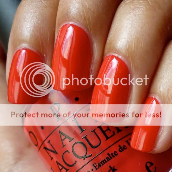
i used my usual bc/tc combination of barielle hydrating ridge filler and poshe for this mani; with these products, i'm usually functional about ten minutes after i finish polishing, as long as i'm careful. i found, however, that flyin' high remained wet much longer than my other manicures typically do. in fact, when i went to grab something out of my makeup bag about half an hour after finishing my mani, i came away with several smudges and deep gouges in my polish. boo! the color is so great, though, that i almost don't care.

4/14/2010

swatch: opi that's hot! pink

earlier this week, i decided i wanted a bright pink mani to match the warm weather we were having and the flowered dress i was wearing:


opi that's hot! pink is a very bright blue-toned pink - normally i stay away from such colors because of my warm undertones, but i think the brightness of this shade makes it work even on my yellow-toned skin. this polish is more sheer than most of my other opi cremes (which generally go on well for me in two coats), but it was pretty much opaque in three coats and its application was otherwise good. the accuracy of this photograph is off in some browsers, so please note that that's hot! pink is an *extremely* vivid/saturated pink irl.

4/13/2010

swatch: opi red my fortune cookie

here's another polish i picked up from opi's recent hong kong collection - red my fortune cookie:


i love warm, bright reds, so rmfc is a great addition to my collection (please note that while this color looks orange-toned in some browsers, that isn't accurate). its application is good as well: not only is it thin yet pigmented enough to be opaque in two coats, but it also has opi's awesome pro-wide brush, which helps me to do a neat mani in just a few minutes.

this polish is also a nearly perfect dupe for rbl bangin' - i'll post a comparison later.

4/05/2010

rescue beauty lounge surf collection swatches: 360, bangin', and diddy mow

what better way to come back from my little blogging break than with the latest collection from my absolute favorite polish brand, rescue beauty lounge? the spring/summer surf collection is now available again for pre-order through this wednesday, april 7, so i thought i'd share my swatches for those of you who are debating whether or not to take the plunge on these.

by the way, the formula on all of these polishes is absolutely perfect. creamy, smooth, buttery, pigmented... exactly what i expect from rbl. each of these polishes was close to opaque in one coat and was perfect in two.

diddy mow is a completely unique and seriously cool blend of gray and green. i can see myself reaching for this polish again and again and again come fall:


here's a close-up of diddy mow to show its secret shimmer:


360 is a muted medium aqua that's very pretty. it's slightly darker than what i'd normally consider a summery color, but it works:


the secret shimmer in 360 is slightly stronger than the secret shimmer in diddy mow - here's a close-up:


and finally, bangin' is an amazingly bright warm red creme and my current notd. i know many are passing on this color because it seems dupey, but i consider bangin' to be the ultimate, most beautifully pigmented version of my favorite polish color. some browsers are doing funny things to this pic, so please know that this is pure red, not orange at all:


okay, basketball needs my attention again. gordon hayward is so boyishly adorable; i want to fix him a grilled cheese sandwich or something. maybe bring him a glass of chocolate milk.

3/26/2010

swatch: bb couture poison ivy

hi everyone, sorry for my absence from the blog lately! the past couple of weeks have been crazy-busy, but hopefully i can get back into the posting groove again smoothly! so without further ado, here's a green notd from last week, bb couture poison ivy:


the formula on this is a tiny bit thick, but i found that worked to my advantage as i was in a rush to get out the door for my st. patrick's day plans and wanted something with serious coverage. and poison ivy didn't disappoint, as it was opaque in two quick coats.

by the way, i don't normally comment on any nail polish's wear time because i change my mani so frequently, but i recall being very impressed with the lasting power of this polish. i kept this mani on for four days last week, and even though i'm seriously hard on my hands, i didn't get even the tiniest chip.

the fact that i was able to keep this mani on for so long when i normally have to change my polish every day out of boredom is also a comment on the quality of the color. poison ivy is a vibrant green creme - brighter in the sunlight (for example, in the picture above) and darker indoors - and i really enjoyed having it on my nails.

and also, for those of you who are coming here from getcha nails did, welcome! thank you brooke for mentioning my little blog!

3/15/2010

swatch: american apparel downtown la + china glaze medallion

after i got bored with my aa downtown la mani, i topped it with chg medallion (fine gold glitter and larger holographic glitter in a clear base) to give it a fresh look. please keep in mind that these photos were taken right when i woke up and in the middle of a storm… in other words, not in the best lighting conditions. i can only imagine how blingy this manicure would be in full sunlight!


and here's a blurred close-up to show how glittery and fun this look is:


love! i needed something sparkly to cheer myself up in this gross weather, and this fit the bill perfectly. for the base color, i used two coats of downtown la, and for the glitter effect i used one coat of medallion on my ring and pinky fingers and two coats on my index and middle fingers. just a warning, medallion is a pain to remove, but i'm sure the foil method would get it off quickly and painlessly!
Related Posts Plugin for WordPress, Blogger...