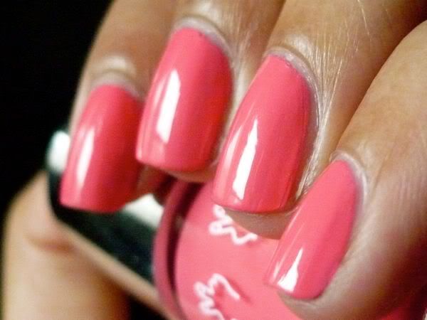
i was expecting this to be a creamy coral-pink based on pics, but it turned out to be pretty much a neon. tbh, i'm pretty bummed about this one; it was quite chalky and thick, and i expect better from a nails inc. creme. and of course, given its neon hue it was a major pain to photograph - i made a half-hearted attempt to photoshop this picture into color accuracy but gave up pretty quickly. in this picture we have 3 coats, plus touchups:
now off to do a quick mani - must think of something that will entertain me through a full day of teaching plus be party-appropriate for evening!


It doesn't look like a neon. Looks fantastic on you even thought you don't like it.
ReplyDelete