scrangie is on my index and ring fingers; typhoon lagoon is on my middle finger and pinky. irl, they generally appear more different than they do in this pic (i think because the shimmer takes over in photos and makes it harder to see the differences in base color), but at some angles/in some lighting they do look quite similar.
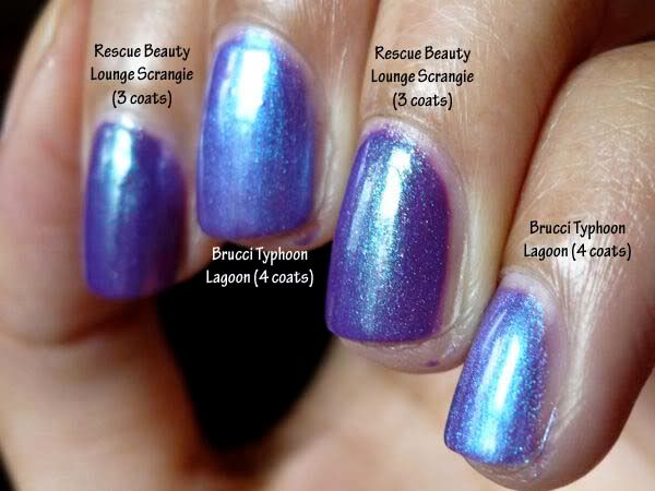
main differences:
- opacity: this swatch is 3 coats of scrangie and 4 of typhoon lagoon. i bet scrangie would've only needed 2 though, had i been more careful.
- shimmer particles: the shimmer in typhoon lagoon is more "frosty" (which imo makes it more cheap-looking), whereas the shimmer in scrangie appears in larger, distinct particles. this difference is seen better in the pic below than in the one above.
- color of shimmer/duochrome effect: typhoon lagoon's is plain light blue, whereas scrangie's is green/greenish (which makes it, imo, more interesting).
- base purple color: scrangie has a slightly darker purple base color than typhoon lagoon, and then the fact that scrangie's shimmer is in particles rather than an all-permeating frost makes it look darker still (because the overall appearance of the polish isn't lightened by the shimmer in the way that typhoon lagoon's is). here's a pic that shows this well:
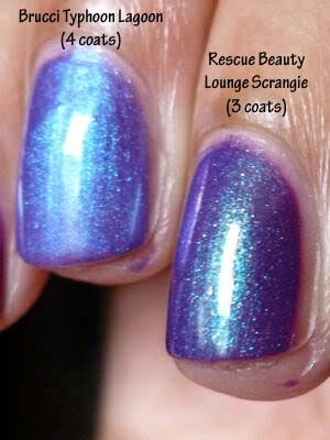
overall, i greatly prefer scrangie, not only for its ease of application but also for its darker purple color and its distinct shimmer particles rather than frosty appearance.


They do look similar. Maybe to the uninitiated. I can see the difference. I only have Scrangie.
ReplyDelete