Showing posts with label finish: creme. Show all posts

8/27/2011

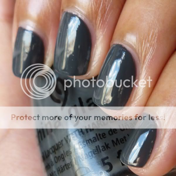
China Glaze Concrete Catwalk: Swatch Picture

Concrete Catwalk is a nice, dark, blue-toned gray creme! I'm looking forward to wearing this shade once fall fully hits:


The formula on this polish was a little thicker than I expected, but overall quite nice; I used 2 coats to achieve evenness. I love dark gray - it works so much better on my skin tone than medium grays do!

8/26/2011

China Glaze Sea Spray: Swatch Picture

Sea Spray is a polish I wasn't expecting to like quite as much as I did! Normally I avoid cooler-toned colors, but this grayed-out pale blue was surprisingly pretty on my skin tone, I thought:


Sea Spray was opaque in 2 coats, but I wound up doing 3 just for complete evenness. This polish has an almost imperceptible pearly shimmer that gives it a beautiful softness. I will definitely be wearing this one again!

8/24/2011

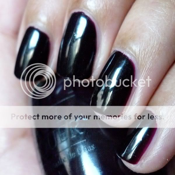
OPI Lincoln Park After Dark: Swatch Picture

I love a vampy creme, and there's a reason OPI Lincoln Park After Dark is considered to be a classic! 2 easy coats to dark evenness.


Forgive the lack of commentary on some upcoming posts: I just came across a ton of old pictures in my Photobucket and am trying to get them up as quickly as possible, since the new school year is just around the corner and I have tons of things to do! I just know that I'd rather see swatch pictures with minimal commentary than no posts at all, and I hope you guys feel the same way!


8/22/2011

Nails Inc. Victoria & Albert: Swatch Picture and Review

If I recall correctly, Nails Inc. Victoria & Albert is one of the favorites of the red creme queen herself - tobywoo - so you know it has to be good.


And it is! Unfortunately, my picture doesn't do it justice, but Victoria & Albert is a super-smooth, even-flowing, beautiful red creme. When I first wore it, I remember being so impressed with the ease of application and rich pigment of the polish, especially considering that it's quite thin. While V&A was perfect in two coats, it's not quite warm-toned enough to make its way into my very favorites… but that doesn't mean I don't appreciate how lovely and high-quality it is!

8/19/2011

Rescue Beauty Lounge No More War vs. MAC Dry Martini: Comparison Swatch Picture and Review

On Monday, I posted a picture of olive-green-brown RBL No More War. Another shade in the same general color family (albeit a much darker and browner version) is MAC Dry Martini, which was released as part of the Nail Trend FW09 Jin Soon collection (along with Cool Reserve, Dance All Night, For Fun, Rich Dark Delicious, and Beyond Jealous… none of which I bought). The marked difference between the two polishes can hopefully be seen in the following comparison shot:


In the picture above, RBL No More War is on my index and ring fingers, while MAC Dry Martini is on my middle finger and pinky.

I discuss the qualities of No More War in Wednesday's post. As for Dry Martini, it was my first MAC polish, and going in I was a bit worried as I'd heard bad things about the application of MAC polishes. However, Dry Martini was creamy, even, and richly pigmented (the swatch you see is two coats), and on top of that I loved the brush! It made for easy, neat application

8/18/2011

OPI Tasmanian Devil Made Me Do It: Swatch Picture and Review

From the OPI Australia collection:


Bright, super-orange-toned red! Easy application and nice pigmentation, but for orange-toned reds my heart belongs to OPI Monsooner or Later.

8/17/2011

Rescue Beauty Lounge No More War: Swatch Picture and Review

Some people love browned olive green shades; others hate them. Regardless of which side of the spectrum you fall on, these colors are certainly unusual.


RBL No More War was released as part of RBL's Fall/Winter 2008 collection, one of the very first polish collections I fell in love with. I remember loving the juxtaposing of more traditional shades like dirty pink Plie and plum-brown Bruised with less traditional colors like dark blue-green Teal and of course, No More War. RBL used to have a salon right by my apartment and I fought with myself for weeks, trying to justify the purchase of such expensive polish, before I finally made my way in and bought Teal. Plie, Bruised, and No More War came later, in one of RBL's famed 50% off sales, but eventually they found their way into my Helmer too!

This polish was a pleasure to apply, smooth and opaque in 2 coats. I have to say that I don't love this particular color against my skin tone (although I'll bet it looks darker and therefore better on pale skin), but I do like deeper versions of the shade. Stay tuned for a comparison with MAC Dry Martini, which I much prefer!

8/16/2011

OPI Monsooner or Later: Swatch Picture and Review

I think this is my very favorite red creme. RBL Bangin' and OPI Girls Just Want To Play are up there, but at the end of the day my tan skin makes me prefer my reds orange-toned.


Super bright (maybe too bright for some, but perfect for me), warm-toned, and a dream to apply! What more could I want?

8/05/2011

Illamasqua Boo over Essie Sexy Divide: Swatch Pictures and Review

Finding Illamasqua Boo was such an ordeal for me... it wasn't officially being sold in the US (and I was loath to pay hefty international shipping fees from the Illamasqua website), but I'd heard rumors of a few mislabeled bottles somehow making their way to Sephora! So one freezing New York winter day, just before Christmas, I put on my wool cape (no, really) and set off up the island of Manhattan, on a quest to hit every Sephora in my path. And after half a dozen stops, pausing to hurriedly open up every bottle of "Collide" at each one, I struck gold! One "Collide" was actually "Boo"!


Since Boo is glitter in a clear base, I layered it over Essie Sexy Divide in these photos.


Sadly, my tale has a rather disappointing end: after all that hunting, it turns out I didn't even really like Boo on my nails that much, and I swapped it away to a better home. Recent nailboarders have had it a bit easier in their quest for Boo, as the Holiday 2009 Boo/Baptiste duo recently went on sale on the Illamasqua website for just £10! It appears to be sold out now, but there's always swapping...

12/02/2010

swatch: color club high society

wow, talk about a polish that looks really different against different skin tones... compare how it looks on me (tan and warm-toned) to how it looks on scrangie (pale and cool-toned)! this is a shade that looks much better on light skin, imo.


please excuse the boosh remnants still stuck in my cuticles! i wore this np, from color club's rebel debutante collection, a few days ago to start the week off with a work-appropriate shade. application was smooth and opaque in two coats.

boy says: "i had a packard bell legend computer in 1994. it was this exact color."

5/21/2010

american apparel summer 2010 swatches part 1: butter, malibu green

hi everyone! sorry for my absence the past couple of days... we've hardly had any sun around here, which makes photographing polishes no fun! this morning, however, we had some nice weather, so i thought it would be a great time to swatch a couple of the latest offerings from american apparel.

as i've posted before, being a die-hard creme lover i'm a big fan of smerican apparel's range of polishes, so i was thrilled to hear that this summer, they were expanding their line to include five new colors: butter, california trooper, l'esprit, malibu green, and summer peach.

i had mixed feelings about butter - i loved the color, a gorgeous warm soft yellow, but i did have issues with the application:


yellows are notoriously difficult to apply, and butter wasn't particularly awful in that respect; it was both thick and runny, and somewhat streaky as well, but most people could probably get it to work in three thick coats (since i didn't figure this out through midway through my application, i used four regular coats for the swatch above). however, the american apparel brush is designed in such a way that the stem retains a lot of polish even if you wipe off your brush well, causing drips and mess if you aren't careful. thus, in order to have a controlled, neat manicure, you have to wipe off the brush and stem so thoroughly that you simply don't have enough polish left to do properly thick coats. if you're able to figure out how to apply butter in a way that works for you, though, the color is very pretty.

malibu green on the other hand, had an awesome formula, and i really liked the color as well:


(please note that the polish is brighter and more saturated irl.) this had the thin, super-pigmented formula that i love and think of as being typical of american apparel's polish! with all my love of crazy polish i've never really ventured into bright blues and greens, so i was surprised by how much i loved this shade... i actually wound up wearing it for three days! the formula of this polish was excellent - smooth and very easy to work with - and it was opaque in two thin coats. malibu green makes a great pop of color against the blacks and neutrals i insist on wearing even throughout the summer, and i'm looking forward to breaking it out again.

i should have the rest of the american apparel summer colors (california trooper, l'esprit, and summer peach) swatched and posted for you on monday... i'll update this post with a link once that's done. happy weekend!

disclosure: the products in this post were sent to me by american apparel for consideration
5/13/2010

swatch: opi girls just want to play

i love this! from the 2008 holiday in toyland collection:


girls just want to play is brighter and more pink-toned irl and has a totally fabulous formula (two coats seen above). i can see myself wearing this again and again!

5/12/2010

swatch: nails inc. brook street

i've been trying to photograph my notd, opi ogre-the-top blue, for the past two days now with no luck - it's been so overcast here that i don't have enough light to get a color-accurate pic. so here's an notd from last week instead, nails inc. brook street:


this is a very pretty pink-toned coral... i love it! it reminds me a bit of rbl coral, but the two polishes certainly aren't identical. i paired brook street with a fluorescent yellow dress, brown chunky platform sandals, and a bright red pedi. :) three coats.

5/11/2010

swatch: nails inc. hollywood

fabulous candy pink!


unfortunately, the application of this shade wasn't quite so fabulous - it was somewhat streaky and patchy, requiring me to apply it thickly to get it even in three coats. these application issues surprised me, as nails inc. polishes tend to have a consistently good formula. i love the color, though, so i can definitely see myself reaching for hollywood again... just not when i'm in a rush or need an easy mani!

5/10/2010

comparison swatch: opi mrs. o'leary's bbq and opi vampire state building

opi mrs. o'leary's bbq is widely reputed to be a dupe for the htf opi vampire state building. in my opinion, however (and unfortunately for those of you seeking a more easily accessible alternative to vampire state building), the two polishes aren't actually identical.

in the following photos, i have vampire state building on my index (leftmost) and ring fingers and mrs. o'leary's bbq on my middle and pinky (rightmost) fingers. i did three coats of each polish, although mrs. o'leary's bbq (owner of one of my favorite polish abbreviations ever, "molbbq") only needs two if you let it dry a bit longer than i did.


vampire state building and mrs. o'leary's bbq have completely different undertones, and the difference between the polishes is visible in regular natural light. vampire state building's undertones are brown, while those of mrs. o'leary's bbq are purple. the two shades are closer on the nail than in the bottle, though.

vampire state building and opi a man in every port-ugal look closer in the bottle than vampire state building and mrs. o'leary's bbq do (leaving aside a man in every port-ugal's subtle shimmer); i'll comp them at some point.

here's a lighter (albeit slightly washed out) pic to better show the different tones of the two polishes:


btw, for those of you who are interested, i posted a full mani with molbbq here.

swatch: opi miami beet

when changing my polish yesterday afternoon, i had my roommate pick my mani. she suggested a "bright, red-toned purple," and the closest thing i had in my untrieds was opi miami beet!

here it is in the sun:


and since this polish darkens considerably in dimmer lighting, here it is in regular natural light (it's darker still indoors):


when i was placing the etailer order in which i got miami beet, i idly wondered to myself how i'd managed to do without this shade for so long, considering the number of people who rave about it. once the polish had arrived and i had unpacked it, though, i remembered why i'd avoided picking it up in the past - it's reputed to be a dupe for zoya moxie, which i already own. the two polishes do look slightly different in the bottles, so i'll need to do a comp at some point to figure out their precise similarities and differences.

by the way, with regard to formula miami beet is like the vast majority of the opi cremes i own - pigmented, smooth, and opaque and two coats.

5/08/2010

streetwear moody: swatch picture and review

i was lucky enough to find this vhtf polish in a dusty just last week!


this is often referred to as the "creme" version of moody (sometimes spelled "mmoody"), but this polish isn't actually a pure creme. instead, it features a subtle but still visible shimmer. this shimmer may be a bit difficult to detect in this picture, however, because this polish reacted badly to the seche vite topcoat i applied over it, resulting in lots of small bubbles and other texture issues. apologies! btw, this swatch is of three coats of moody.

the other (and much more common) version of moody that i own isn't opaque, isn't creme-like, and isn't turquoise/teal; instead, it's a very sheer blue shimmer. at first i thought i'd never wear it, but after seeing emalc's pic of this sheer version of moody layered over black, i'm starting to think i should at least give that layered look a chance.

5/07/2010

swatch: nails inc. upper street

a very pretty jelly-ish aqua shade:


when i first started to apply upper street, i was concerned that it would need several coats for opacity (and i was feeling lazy that day); luckily, it became even with the addition of a second coat. a comp with chg flyin' high and chg shower together is in the works!

5/05/2010

swatch: opi paint my moji-toes red

i got this on sale for $1.99 at ricky's... hurray!


two coats. this polish was an absolute dream to apply - it glided on soooo smoothly. the color of this photo unfortunately varies a bit from browser to browser, so if it looks salmon or quite muted to you please know that that isn't an accurate representation. irl, paint my moji-toes red is a pink-red that's quite vibrant.

5/04/2010

swatch: nails inc. draycott pl.

we had such summery weather here in new york this past weekend that i decided it was time to break out this fabulously juicy orange!


draycott pl. is my new favorite orange - it's so vivid and so pigmented. i wore it with this dress to wander around the city on a hot saturday afternoon, eating raspberry sorbet and idling in union square park... totally freaking awesome. two coats.
Related Posts Plugin for WordPress, Blogger...