Showing posts with label color: gray. Show all posts

8/27/2011

China Glaze Concrete Catwalk: Swatch Picture

Concrete Catwalk is a nice, dark, blue-toned gray creme! I'm looking forward to wearing this shade once fall fully hits:


The formula on this polish was a little thicker than I expected, but overall quite nice; I used 2 coats to achieve evenness. I love dark gray - it works so much better on my skin tone than medium grays do!

8/25/2011

Sephora by OPI Absinthe Makes the Heart: Swatch Pictures

I don't even know what color to call this shade... gray-green?


It has some interesting irregular shimmer:


Absinthe Makes the Heart required 3 coats for total opacity.


8/12/2011

Lynnderella Mercurial: Swatch Pictures and Review

Lynnderella's beautiful polish creations have been popular on the nail board for some time, but until recently, the only way to come by them was to have them gifted to you by the maker herself. Last month, however, Lynnderella began selling her polishes in order to give more people access, which I how I came to own the beautiful Mercurial, part of the First Edition collection!

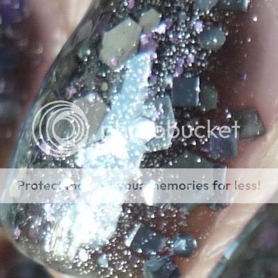
Mercurial is a fabulously complex glitter: it begins with a smokey gray jelly base, which is packed full of silver shimmer, fine lavender glitter, small lavender hex glitter, small silver square glitter, and medium silver hex glitter, all topped off with a little bit of medium black square glitter!

For the swatch pictures above, I used 3 coats of Mercurial. Because of Mercurial's tinted base and heavy glitter saturation, this polish can be worn alone fairly easily, but I think next time I would take my friend Janice's advice to layer 2 coats over Mercurial over a shimmery charcoal base color, partly to conserve this rare polish and partly to achieve evenness more easily.

I'm absolutely in love with Mercurial - it's uber-glittery without feeling childish, as its charcoal color gives it a bit of an edge. It reminds me of sequined, sparkly armor! Another amazing success by Lynnderella!

8/09/2011

BB Couture Ashes: Swatch Picture and Review

I picked up BB Couture Ashes (from the Saints of Ruin collection), even though it's not my typical shade, because I thought it looked and sounded interesting based on Vampy Varnish's review. Unfortunately, the color I received doesn't look quite like I was expecting to get!


What do you think? To me it looks like a pretty straightforward charcoal shimmer, with a different base color from what I expected and none of the multicolored shimmer I was hoping for. I feel like I got a completely different polish! It applied well and was opaque in two coats, but it's not as unique as I thought it was going to be.

Edit: I've since done a bit of investigating and it really looks like my polish is so different from many of the other ones I'm seeing out there. (Examples: 1 2) I take care to make sure my pictures are accurate to what I see on my nails in real life, so I'm wondering if different lighting may have played a role (I take my pictures in natural light) or perhaps skin tone.

12/02/2010

swatch: color club high society

wow, talk about a polish that looks really different against different skin tones... compare how it looks on me (tan and warm-toned) to how it looks on scrangie (pale and cool-toned)! this is a shade that looks much better on light skin, imo.


please excuse the boosh remnants still stuck in my cuticles! i wore this np, from color club's rebel debutante collection, a few days ago to start the week off with a work-appropriate shade. application was smooth and opaque in two coats.

boy says: "i had a packard bell legend computer in 1994. it was this exact color."

1/11/2010

american apparel polish swatches, part 2: berry berry, factory gray, office, and poppy

here are a few more swatches of american apparel's new polishes - my first set of swatches (with dynasty, mount royal, palm springs, and peacock) is here if you missed it earlier.

given that i'm a huge fan of bright warm-toned cremes, it's no surprise that i love poppy:


this is unfortunately another picture that looks quite off in firefox (way too orange) but normal in safari - it's a vivid red-orange in the same family as opi cajun shrimp. pigmentation on this is great, requiring only two coats for nice opacity, and i know i'll be wearing this polish a lot come spring and summer. excuse the smudged ring finger!

office looked better on my skin tone than i expected, although my favorite mint green is still bb couture laguna lagoon:


this picture is unfortunately off in ff as well (only slightly this time - it's just a bit too light and not blue enough). office was a bit less pigmented than the other aa polishes i tried, requiring three coats for opacity instead of the two the rest required. in a lot of the swatches i've seen this has a strong grayish tinge, but that's not detectable on me. as i look at it against my skin right now, it appears to be pretty much a plain mint green… which unfortunately makes it a lot less interesting than i'd expected!

factory gray changes quite a bit depending on the lighting. sometimes it's a standard gray creme...


while other times it has a strong purple tone (which is again, unfortunately, only really showing up in safari):


factory gray, like dynasty from my last post, is less pigmented than many of the other aa cremes i swatched but is still opaque in two coats. i find it quite unusual and interesting when it has that purple hue to it, but when it's just a regular gray it seems pretty boring to me. this may be because i don't much care for grays on myself, though… i mean, i'm sure poppy has lots of close dupes but you don't see me calling that one boring! ;)

and finally, i loved berry (edit: the aa website is now calling this "berries," but i could've sworn it used to say "berry berry"? weird.):


this polish seems to me like it should be dupable… but whatever the dupe is, i can't think of it! i don't have much to say about this one except that it applied very smoothly and was quite pigmented (perfect in two coats), and i can't wait to wear it as a full mani!

i plan to go back to posting my regular notds for a bit now, and then when i get a bit of free time, i'll add a third part to this american apparel series with some comp swatches. :)
11/23/2009

swatch: nails inc. berkeley square

sorry to have slacked off on the notd posting... all the swatching i was doing for the nb top 20 totally killed my desire to take even more nail photos. but i'm back!


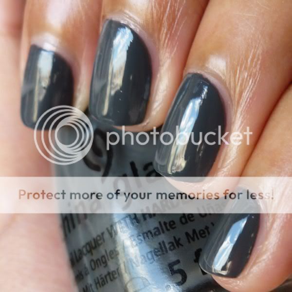
asoifhdsohfihwhas obsessed!!! i love how dark this cool-toned gray is, and it has that famous nails inc. application - wonderfully creamy, richly pigmented, and absolutely perfect in two coats.

the nails inc. formula is right up there with rbl's and illamasqua's; in my experience, nails inc. and rbl polishes are a bit more "flowy" than illamasqua lacquers (which, in contrast, generally go exactly where you put them), but their pigmentation is richer and more consistent. that said, all three brands are excellent, and the differences between them that i'm mentioning are quite subtle.

bf says: "WHOA i like that color a LOT. it kind of has blue tones."

11/09/2009

swatch: nails inc. the southbank

a lovely light gray creme... not so hot with my skin tone, but i do like it in the abstract. still on the hunt for an even lighter gray creme (shimmer-free, please), which i'm hoping will provide the contrast i'm looking for.


the above photo is of two coats - normally i think the southbank would be perfectly even and streak-free at that point, but unfortunately i was applying it in a mad rush. don't blame the polish!

edit: for really great pics of this polish, check out tobywoo's post here... very helpful comp swatches, too!
Related Posts Plugin for WordPress, Blogger...