Showing posts with label color: purple. Show all posts

8/24/2011

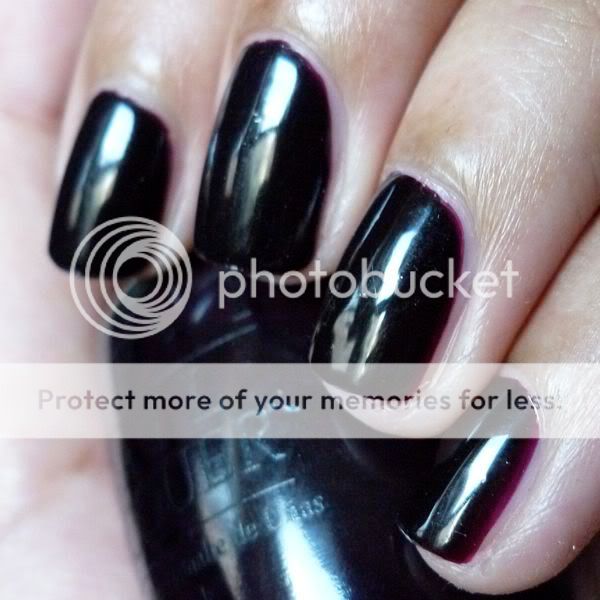
OPI Lincoln Park After Dark: Swatch Picture

I love a vampy creme, and there's a reason OPI Lincoln Park After Dark is considered to be a classic! 2 easy coats to dark evenness.


Forgive the lack of commentary on some upcoming posts: I just came across a ton of old pictures in my Photobucket and am trying to get them up as quickly as possible, since the new school year is just around the corner and I have tons of things to do! I just know that I'd rather see swatch pictures with minimal commentary than no posts at all, and I hope you guys feel the same way!


8/11/2011

Essie Sexy Divide - Swatch Picture and Review

I wore this rich purple shimmer as a base under Illamasqua Boo! in an earlier post:


Sexy Divide (what does that name even mean?) is vibrant and pigmented, reaching opacity in 2 easy coats. If you like purple shimmers, this is a classic!

8/05/2011

Illamasqua Boo over Essie Sexy Divide: Swatch Pictures and Review

Finding Illamasqua Boo was such an ordeal for me... it wasn't officially being sold in the US (and I was loath to pay hefty international shipping fees from the Illamasqua website), but I'd heard rumors of a few mislabeled bottles somehow making their way to Sephora! So one freezing New York winter day, just before Christmas, I put on my wool cape (no, really) and set off up the island of Manhattan, on a quest to hit every Sephora in my path. And after half a dozen stops, pausing to hurriedly open up every bottle of "Collide" at each one, I struck gold! One "Collide" was actually "Boo"!


Since Boo is glitter in a clear base, I layered it over Essie Sexy Divide in these photos.


Sadly, my tale has a rather disappointing end: after all that hunting, it turns out I didn't even really like Boo on my nails that much, and I swapped it away to a better home. Recent nailboarders have had it a bit easier in their quest for Boo, as the Holiday 2009 Boo/Baptiste duo recently went on sale on the Illamasqua website for just £10! It appears to be sold out now, but there's always swapping...

5/14/2010

swatch: china glaze electric lilac

i'm still wearing opi girls just want to play from yesterday, so here's a polish i swatched recently - chg electric lilac:


electric lilac is quite sheer and i didn't feel like building it up to opacity, so for this picture i put two coats over nails inc. basil street (a beige-nude creme). the polish was pretty goopy, so i was glad i made the decision to not struggle through four coats of it.

happy friday! hope you all have a nice weekend. :)

5/06/2010

swatch: nails inc. belgrave place

nails inc. belgrave place (not to be confused with nails inc. belgrave square, a shimmery pink) is amazing! it's a beautiful, vivid, super-glossy blurple jelly:


this polish totally, totally rules. depending on the lighting conditions, it ranges from a purple with strong blue undertones to a deep, rich blue to a shiny, gorgeous vampy. (my pic might be a bit too blue in some browsers; sorry about that!) a particularly great thing about belgrave place is that while it's a jelly, it doesn't come along with the annoying side effect of most jellies: vnl (visible nail line). instead, it was opaque in three coats.

2/26/2010

swatch: rescue beauty lounge purple haze

recently, i've gotten a couple of emails from people asking how to follow my blog - i actually didn't have the followers widget added because i personally use google reader instead, but i've just added the followers tool to the top of my sidebar for those of you who have been looking for it. i'm sorry about the confusion! and now, on to the polish:


a fairly vibrant medium purple with only a slight touch of gray, rbl purple haze in my opinion doesn't look its best on darker skin tones (a problem with most light-medium purples, i've found). while it's a pretty color and looks great on others, it doesn't quite pop on me in the same way. instead, it blends into my skin tone (not quite as badly as american apparel dynasty, however) and doesn't provide the contrast and boldness i typically look for in my nail colors.

on the plus side, the application of this polish was good. on the first coat it seems a bit like a jelly and as if it might require three coats for opacity, but it quickly evened out with just a second coat.

bf says: "there's a flaw in your application!"
me: "no, that's a bubble from my top coat. it's a chemical thing; i can't control it."
*long argument about polish application ensues; bf for some reason references marilyn monroe.*

1/06/2010

american apparel polish swatches, part 1: dynasty, mount royal, palm springs, and peacock

i own an embarrassing number of tri-blend tees and lamé leggings, so i was stoked to hear american apparel had come out with its own line of nail polish. even before i did my research, i was pretty sure they'd be all cremes… and much to my delight, they were! just fyi, these polishes are available on the aa website for $6 each, although i got mine at my local aa store, which was selling 3 for $15.

i want to start with my absolute fave from this collection, peacock:


it was love at first sight for me and this polish! peacock is a gorgeous, richly pigmented teal that was perfectly opaque in two thin coats. when i get a chance i plan to compare this to illamasqua muse and a couple of other teals i have. gahhh i can't stop staring at this color; it's so beautiful.

probably my second favorite of the aa polishes i swatched was mount royal:


unfortunately, this photo looks quite different in different browsers, and i have no idea which version most of you are seeing. :/ please know that mount royal is *not* a straight-up blue creme; rather, it has a purple tone to it. the first time i tried to apply this polish i found it a bit on the thick side, but upon a second attempt it was pretty workable, so i may have to blame user error for this issues i originally had. like peacock, this polish is practically opaque in one coat and perfect in two. quite unique in my collection and really lovely.

i'm still undecided on how i feel about palm springs:


one thing i can say in this polish's favor is that it applied very well for a a pale shade - it was smooth and opaque in two coats, with only a couple of touch-ups needed. i'm not entirely sure who this shade would suit (don't you think it kind of looks like i smeared too-light concealer on my fingertips?)… i need to try it on myself again now that i've chopped my nails. i pretty much always feel better about a polish when i wear it on super-short nails.

and i absolutely hated dynasty on myself, but luckily it'll soon have a good home with a friend of mine:


a dusty light-medium purple in the same general family as opi parlez-vous opi and streetwear jelly, dynasty was less pigmented than the other aa polishes i swatched but still opaque in two coats. unfortunately, wearing this shade reminds me of the reason i got rid of pvo - polishes this color are too close to my skin tone, so they make me look like i've lost circulation to my fingertips or something. if you're ~nc42, i'd steer clear!

part 2 (featuring berry berry, factory gray, office, and poppy) will be up soon, as soon as i have a chance to swatch.
12/31/2009

swatch: nails inc. victoria gate

happy new year's eve to all! this is my absolute favorite holiday... it's so full of promise.

here's a recent notd, nails inc. victoria gate (three coats):


i am lame and sleepy, so i have enlisted my bff poonam to give you her commentary on this shade:
"victoria gate has an excellent application, like so many of the nails inc. shades. the color is a strong berry with purple elements and, while i would hesitate to recommend it as a "fun frolicky" shade, this jewel tone is subtle and extremely apropos for the holiday season! it reminds me of christmas ornaments of days of yore! i would recommend pairing it with a fun colored cocktail or festive footwear for maximum holiday enjoyment! countdown to the new year on my end is 35 minutes, so off i go!"

...mama hearts her exclamation points. see you all in 2010!

12/16/2009

swatch: opi lincoln park after dark suede

hi everyone! sorry for my absence this past week - i got caught up in helping a friend with a cross-country move, yikes! today i'm headed back to california to spend the holidays with my family; while i won't have access to my full stash during my trip, i did prepare a few swatches so that i'll have something to post for the next couple of weeks. and since for the next few weeks i won't be living on the sixth floor of a walk-up apartment building, i may actually be able to do a few outdoor photos as well!

here's a polish i wore as my notd recently, opi lincoln park after dark suede:


imo, opi's suedes are far better than their mattes (which just look like gloppy dried paint to me); their chunky shimmer gives them a unique appearance, and they look very smooth on the nail. they apply smoothly as well - the above swatch is of two coats that went on quite effortlessly and dried very quickly.

unfortunately, when it comes to wear time these polishes fall short. my manicure above was absolutely destroyed after a day and a half - we're talking huge chips and polish rubbed off in swaths on at least half of my nails. boo!

11/28/2009

comparison swatches: avon golden twilight, china glaze wagon trail, and opi ds mystery

a friend on the nb was planning an avon order and was curious how golden twilight compared to some similar polishes from other brands, so i took the opportunity to do these swatches:


from left to right:

china glaze wagon trail (on my index finger) is a black base color packed with fine gold shimmer, giving the polish an overall olive appearance. it's a well-done polish, but the shimmer is too fine to really appeal to my taste these days.

avon golden twilight (on my middle finger) actually has a very deep blue-purple base (captured well by steph's closet), but it looks pretty much black on my nails. the gold shimmer in golden twilight is chunkier than the shimmer in wagon trail yet doesn't shine through the base color well, giving this polish a muddy appearance. i wish i'd passed on this one!

opi ds mystery (on my ring finger) is my favorite of the bunch. while it's not the deep purple holo i had imagined when i first heard that a purple ds polish was in the works, i still love it. this polish has a base color that's much more strongly purple than golden twilight's (although to be fair, it's still quite close to black) as well as very chunky gold shimmer that stands out nicely. i'll definitely be doing a full notd with this one soon.

11/14/2009

swatch: sally hansen nail prisms turquoise opal

please excuse how unbelievable crappy these photos are. not only was it gray and rainy all day, but my camera has also started refusing to go into macro mode. argh!!! hopefully once we have a bit more sunlight here these problems will resolve themselves.


(can you believe that last pic is of the same polish?!)

this is one coat of turquoise opal over one coat of wet 'n' wild black creme. bc is such a pain to use, thanks to its horribly floppy and imprecise brush, but i've been using it for layering 'cause i'm hesitant to overuse my booooooooosh lest i run out. i should've bought nine million boosh backups during sephora f&f!

i hate to tag turquoise opal as a duochrome when it actually flashes teal, red-purple, lilac, blue, and on very rare occasions (like for half a second under my desk lamp last night), amber-gold... a very unique polish. it's a little frosty for my taste at times, but once it starts flashing all these amazing (and seemingly unrelated) colors, its frostiness becomes a non-issue in my mind.

bf says: "that's the t-1000 of nail polishes... it's ever-shifting!"

11/13/2009

swatch: rescue beauty lounge scrangie


this color is absolutely beautiful in the sun; the duochrome comes alive and the individual shimmer particles can be seen distinctly. however, i'm not in the sun that often (especially not in new york in november), and in the shade i like this polish much less. in the absence of sunlight, scrangie's shimmer appears frosty rather than particulate, and the duochrome effect becomes so subtle as to just make the base purple color look dull and muddy. both of these issues are completely understandable and couldn't have been avoided in the creation of this polish (or for that matter, any duochrome shimmer), but they're still issues that make me eager to change my mani and remind me why i don't normally do duochromes.

application on this was great, just like i'd expect of an rbl - three thin, easy coats to perfection. i know some girls on the nb reported that their bottles were streaky and chunky, resulting in bald spots and the need for "impossibly thick" coats, but i had none of those issues.

by the way, for those of you wondering how this compares to brucci typhoon lagoon, i did a comparison here.

bf says: "holy moly i like that np." (yes, he's also started shortening "nail polish" to "np." ha!)

11/06/2009

swatch: zoya demi

i'm currently wearing (and loving) streetwear fx flash over wet 'n' wild black creme, but unfortunately i won't be able to get a good pic until tomorrow when i have some sunlight. so here's an notd from a few weeks ago...


demi is a lovely red-toned purple creme; however, it's hard to capture accurately. its red tones (which imo are the most interesting thing about it) come out only in the sunlight; in the shade and in indoor lighting, it's substantially deeper in hue, and the reddish undertones aren't as visible. application on this one was good - the above picture is two coats (plus a few touchups) in moderate sunlight.

11/05/2009

swatch: nails inc. st. john's wood

in the middle of organizing my stash (i have a second helmer now, yay!), but here's today's notd, another lovely nails inc. creme:


the application on this was really smooth (as i've come to expect from nails inc. polishes!), and i love the color. most light purples don't stand out well on my skin tone, but this one is unusually vivid. btw, st. john's wood is darker and dustier in indoor light, and the above picture is two coats.

11/02/2009

swatch: zoya lael

sooo sleepy... but a quick post. i'm currently wearing and loving zoya lael, a super smooth dark purple creme:


lael does look darker indoors, but it's still visibly purple in all but the dimmest lighting. and application on this one is easy: the photo above shows even coverage in two coats.

ps. i think this would look great with a gold shimmer layered atop... maybe the new cnd effects jade sparkle?

10/30/2009

comparison swatch: rescue beauty lounge scrangie and brucci typhoon lagoon

just did this for one of the nb girls, so figured i'd post it here as well.

scrangie is on my index and ring fingers; typhoon lagoon is on my middle finger and pinky. irl, they generally appear more different than they do in this pic (i think because the shimmer takes over in photos and makes it harder to see the differences in base color), but at some angles/in some lighting they do look quite similar.


main differences:

- opacity: this swatch is 3 coats of scrangie and 4 of typhoon lagoon. i bet scrangie would've only needed 2 though, had i been more careful.

- shimmer particles: the shimmer in typhoon lagoon is more "frosty" (which imo makes it more cheap-looking), whereas the shimmer in scrangie appears in larger, distinct particles. this difference is seen better in the pic below than in the one above.

- color of shimmer/duochrome effect: typhoon lagoon's is plain light blue, whereas scrangie's is green/greenish (which makes it, imo, more interesting).

- base purple color: scrangie has a slightly darker purple base color than typhoon lagoon, and then the fact that scrangie's shimmer is in particles rather than an all-permeating frost makes it look darker still (because the overall appearance of the polish isn't lightened by the shimmer in the way that typhoon lagoon's is). here's a pic that shows this well:


overall, i greatly prefer scrangie, not only for its ease of application but also for its darker purple color and its distinct shimmer particles rather than frosty appearance.

10/29/2009

swatch: color club wild at heart

from the archives...


this polish applied like a dream and was very nicely pigmented - this is two coats. in the sunlight the holo comes alive, but unfortunately no sunlight was getting into my apartment the day i took this photo! boooo to gloomy nyc weather. even with its holo less than visible, however, wild at heart is a gorgeous shade of purple.

10/28/2009

10/27/2009

swatch: rescue beauty lounge mismas

the most amazingly smooth, amazingly pigmented purple creme evaaaaar.


this photo is of two coats, but mismas was practically opaque in just one. when i originally saw pics of this polish, i was worried it would be too cool-toned for me, but now that i'm wearing it i don't find that to be a problem at all (and i have very strong yellow/green undertones). in dim/indoor light mismas does get quite a bit darker - and with that, quite a bit cooler - but i don't find that it looks 'off' with my skin tone even then.

swatch: zoya sloane + rescue beauty lounge matte top coat

as per the request of my loyal reader micah (a fan of all things matte), here's an update on yesterday's notd of zoya sloane:


excuse the photo's low quality; this picture was taken under my desk lamp at two a.m. btw, i received the rbl matte top coat from a very generous friend today, and i have to say - it's amazing, if you like the matte look. super easy application, a very pronounced matte effect, and lightning-quick drying time.
Related Posts Plugin for WordPress, Blogger...